Style your React Native apps using Tailwind CSS.
The utility-first workflow you love from Tailwind CSS in your React Native applications. Enjoy consistent styling across platforms with the same intuitive classes.
export default function WelcomeConsentScreen() { return ( <SafeAreaView style={ROOT_STYLE}> <View className="mx-auto max-w-sm flex-1 justify-between gap-4 px-8 py-4 "> <View className="ios:pt-8 pt-12">12345678910111213141516171819202122232425262728293031323334353637383940<Text className="">Welcome to your </Text><Text className="">Application </Text> </View> <View className="gap-8"> {FEATURES.map((feature) => ( <View key={feature.title} className="flex-row gap-4"> <View className="pt-px"> <Icon name={feature.icon}className=""ios={{ renderingMode: 'hierarchical' }} /> </View> <View className="flex-1"><Text className="">{feature.title}</Text><Text variant="footnote">{feature.description}</Text> </View> </View> ))} </View> </View> </SafeAreaView> ); } const FEATURES = [ { title: 'Profile Management', description: 'Easily update and manage your personal information, settings, and preferences', icon: 'account-circle-outline', }, { title: 'Secure Messaging', description: 'Chat securely with friends and family in real-time.', icon: 'message-processing', }, { title: 'Activity Tracking', description: 'Monitor your daily activities and track your progress over time.', icon: 'chart-timeline-variant', }, ] as const;
Welcome to your
Application
Profile Management
Easily update and manage your personal information, settings, and preferences
Secure Messaging
Chat securely with friends and family in real-time.
Activity Tracking
Monitor your daily activities and track your progress over time.
#text-2xl px-8 pb-4 pt-8 #text-4xl px-4 pb-8 pt-12 #text-4xl pb-8 pt-12 Why Nativewind?
  @theme {
    --font-sans: "Inter", sans-serif;
    --font-mono: "IBM Plex Mono", monospace;

    --text-tiny: 0.625rem;
    --text-tiny--line-height: 1.5rem;

    --color-mint-100: oklch(0.97 0.15 145);
    --color-mint-200: oklch(0.92 0.18 145);
    --color-mint-300: oklch(0.85 0.22 145);
    --color-mint-400: oklch(0.78 0.25 145);
    --color-mint-500: oklch(0.7 0.28 145);
    --color-mint-600: oklch(0.63 0.3 145);
    --color-mint-700: oklch(0.56 0.32 145);
    --color-mint-800: oklch(0.48 0.35 145);
    --color-mint-900: oklch(0.4 0.37 145);
    --color-mint-950: oklch(0.3 0.4 145);
    --color-mint-1000: oklch(0.2 0.42 145);
    --color-mint-1100: oklch(0.1 0.45 145);
    --color-mint-1200: oklch(0.05 0.48 145);
    --color-mint-1300: oklch(0.02 0.5 145);
    --color-mint-1400: oklch(0.01 0.52 145);
    --color-mint-1500: oklch(0.005 0.55 145);
    --color-mint-1600: oklch(0.002 0.58 145);
#text-2xl px-8 pb-4 pt-8 #text-4xl px-4 pb-8 pt-12 #text-4xl pb-8 pt-12 Who is using Nativewind?
Built with Nativewind
Open source apps and libraries using Nativewind in their public codebases.
Ten projects selected from verified public package manifests. Project links and dependency evidence are included below.
- 01
- 02
- 03
- 04
- 05
- 06
- 07
- 08
- 09
- 10



#text-2xl px-8 pb-4 pt-8 #text-4xl px-4 pb-8 pt-12 #text-4xl pb-8 pt-12 UI Component Kits
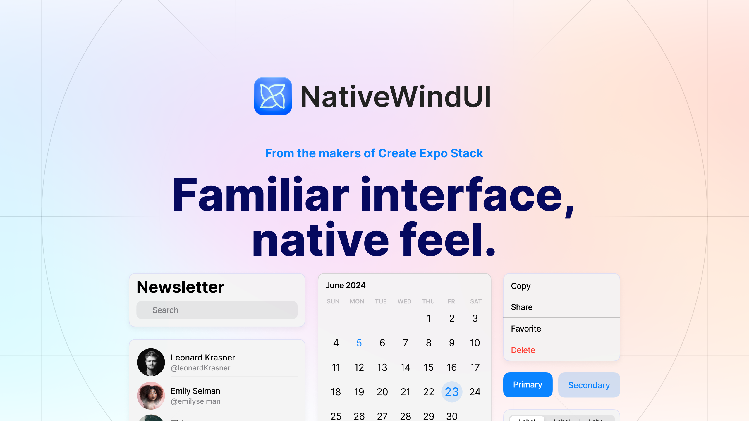
NativewindUI
30+ beautiful components and flows that strive for a native look & feel. The perfect starting point for those who need to ship fast and look good doing it.

React Native Reusables
Build your own component libraries with react-native-reusables. Copy, paste, and tailor the code to suit your specific requirements.
gluestack
Comprehensive React and React Native component library for building modern, high-performance web and mobile apps. Copy-paste UI components library & patterns crafted with Tailwind CSS (Nativewind).